Business Intelligence Best Practices
BI Dashboard Best Practices
Continuing along with our series on rolling out a Business Intelligence solution in an organization, we now turn to the various “Do’s and Don’ts” of building an informative and easy-to-use dashboard. Once you’ve successfully gotten buy-in from the key participants in your BI plan, it will undoubtedly be tempting to rush headlong into this initiative and show off all the impressive bells and whistles that your BI solution offers. Before you do, please consider the following “Best Practices” which will help you avoid the many pitfalls common in new BI deployments.
Know your audience
The first step in creating a BI report is to identify who exactly it is that you intend to be the primary viewers of the report and how they will use it. Keeping that in mind throughout the whole development process will naturally inform which components of the data set should or should not be included.
For example, if your intended audience is the executive team, then you would want a high-level overview of performance metrics and trends with the ability to drill down into more specific data points as they explore. You certainly wouldn’t want to overload the report with minute transaction-level details; those details would be more appropriate for a departmental manager or supervisor.
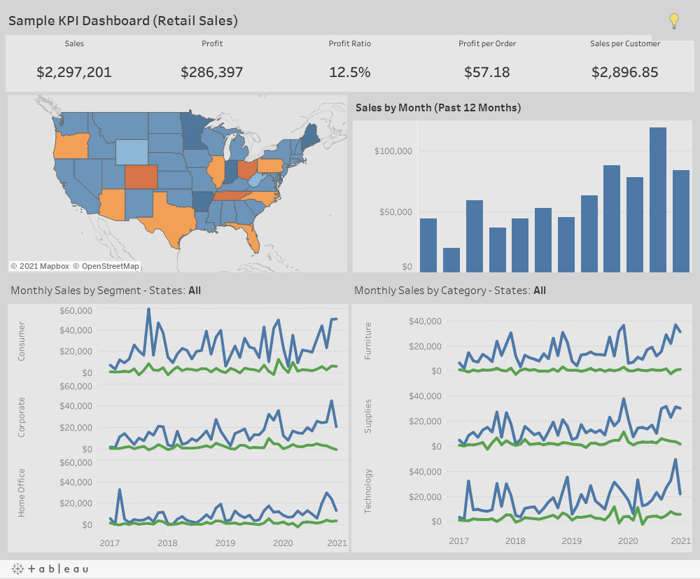
As you can see below, a KPI dashboard with a focus on overall trends and performance would be a good example of a report that could be meaningful to the executive team.
Whereas this dashboard which shows the specifics and details of the shipping department would be beneficial for a warehouse supervisor or even an operations manager—not the CEO or marketing manager.
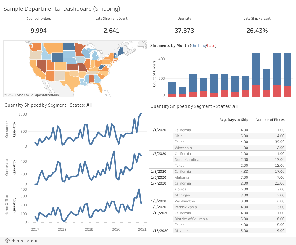
Note that these two dashboards have a very similar design and layout, but the level of detail in the content and target audience cannot be more different.
Define scope
A common pitfall with new BI deployments is attempting to cram too much data into a single dashboard. Keep in mind, there are no limits to the number of reports you can create and often reports have several pages, so you can have multiple dashboards in the same report. Each discrete dashboard should tackle an individual business process. If, for example, you were interested in sales and shipping data, it is highly like that your report would be more usable and clearer to the user to have the data separated into two dashboards rather than shoehorned into one.
To be continued …
Now that the basics of viewership and scope are settled, next week we will cover some more aesthetic best practices when building a dashboard.