How You Can Use Business Intelligence
Previously in our series on Business Intelligence, we touched upon the basics, such as how an organization can benefit, how to uncover hidden insights, and the various type of visualizations that are used to enhance the viewer’s experience. That’s all well and good but, you may be thinking: “how can you use BI in my organization?”
The discovery dashboard we discussed previously is a great first step, but implementing a KPI dashboard is truly an essential part of any BI implementation.
What’s a KPI?
Key Performance Indicators (KPIs) are an essential aspect of a business that can be numerically measured. They range from the self-explanatory basics, such as Total Revenue, Profit Margin, or New Sales Prospects, to the complex, industry-specific metrics like “Weekly Estimated Net Usage Status Electrical Power Consumption by Sector.”
What goes into a KPI dashboard?
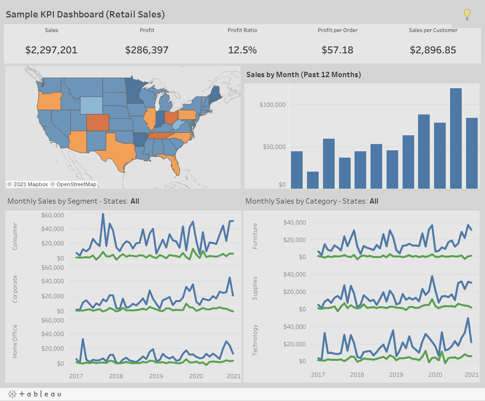
The single most fundamental aspect of the KPI dashboard is the KPI itself. No duh, right? Well, it’s important to state this first because you need to make sure the most important aspects of a dashboard are front and center, so they grab the viewer’s attention. Those KPIs must be prominently displayed. My recommendations are to have a KPI bar along the top or down the left side of the dashboard and make sure to format the numbers in big/bold fonts – extra credit for having those fonts change color if the data reflects something positive or negative. There should be no chance of the viewer mistaking the purpose of this dashboard or misinterpreting the information presented.
Trends are also an important facet of the KPI dashboard. Within each KPI box, we can include context via additional datapoints, such as quarter-over-quarter comparisons or a sparkline that indicates the overall trend over a given time period.
A good KPI dashboard also incorporates certain elements of the discovery dashboard. We’ll want our KPI dashboard to provide backup as to why a metric is good or bad. Are sales down? Well, the viewer should be able to click around quickly and easily to ascertain why. Is net usage up? It will likely be interesting to the viewer to discover the source of that extra usage. A good dashboard should empower the user to go out and discover insights that the dashboard’s author hadn’t even considered!
Please feel free to explore our sample: