Business Intelligence Best Practices Continued
Last week we covered the basic best practices of dashboard design; specifically, with regards to your audience and the scope of the information leveraged by the dashboard. This week, we will cover more aesthetic and usability considerations.
Less is more
Just as you would want to avoid clutter by demarcating dashboards along the inherent boundaries of business processes, you would also want to limit the number of items on each dashboard. The beauty of BI is that you can select from a myriad of different visualization types to show off your data, but this can also be a huge downside if not used with restraint.
Start with the most important aspects of the data prominently displayed in the top or the center and then build out the rest with supporting data/visuals. The secondary elements should augment, not overpower the primary elements.
Unfortunately, there is no clear-cut rule on how many or what types of components to use in a dashboard, but when in doubt, it’s probably best to go with fewer to avoid user fatigue. A good guideline, however, would be to incorporate a banner of key metrics at the top with a distinctive font format and back those numbers up with a handful of visualizations that can be used to slice and dice the data.
Consistent color scheme
If at all possible, try to keep the number of colors used in the reports minimized, and ideally, try to use colors associated with the company’s branding. Too many colors, just like too many components or too much information, is a surefire way to draw the viewer’s attention away from the most important points of the report. Consistency of colors between dashboard assets is also helpful. For example, you wouldn’t want the same shade of blue to indicate total sales in one part of the dashboard and number of customers in another.
It is also best to consider the effect of the palette choice on those with color blindness. With roughly 8% of men and 0.5% of women affected, it is a good idea to avoid color schemes that are commonly problematic such as red and green together.
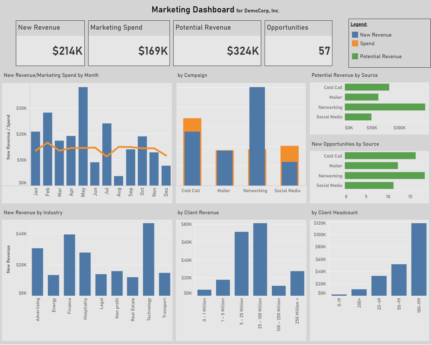
In the image below, note the number of colors is limited to three and each color represents a distinct item being measured: blue for executed revenue; orange for costs; and green for potential new revenue.
Include information about the report
Often a viewer looking at a report for the first time may find it challenging to understand exactly what it is they’re looking at (especially if some of the previous best practices were not followed.) To mitigate such an issue, try to include as much guidance inside the report as possible. A good place to start is by making sure the headers of each component are appropriately descriptive and axis labels on bar and line charts are properly used.
Another good way to guide the user is to have a dedicated text box with explicit details about the scope of the report and what data it is encompassing. If there is anything else that may be unclear, this would be a good place to address it. Note that due to space constraints, it may not be possible to dedicate enough real estate for such instructions. Many BI solutions allow for pop-up boxes to be used, so you can have it both ways.
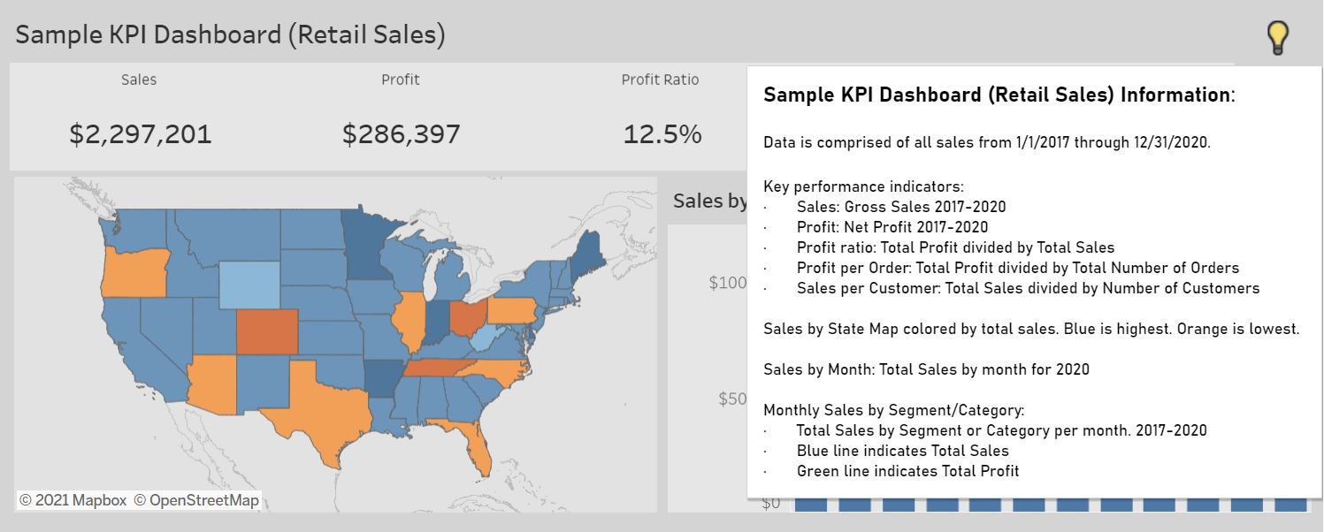
Note the lightbulb in the top right of our KPI Dashboard will provide details about the report including the calculation details and date ranges of each component.
Allow for exploration
Finally, a good report should allow for the viewer to explore the data through interactivity. After all, this interactivity is the whole point of BI. It’s not enough to simply display the data, but the users are going to want to know why the data says what it says. Users need to be able to find those answers either directly within the report or by switching over to another report. In that case, you will want to link the reports so you can help direct the user to the places where they can find those answers.
Please feel free to kick the tires and explore our sample departmental dashboard below.