Power BI: Transform Data into Dynamic Insights
The Microsoft 365 cloud platform boasts a lengthy list of applications, many of which are well known and indispensable. While products such as Word, Excel, Outlook, Sharepoint, Teams, etc. are currently utilized by nearly every enterprise, there are a host of often overlooked apps available. Power BI (BI=Business Intelligence) is a prime example.
Business intelligence tools are software applications used to analyze and interpret data to provide insights and support decision-making within organizations. These tools gather, store, analyze, and present data from various sources, allowing users to create reports, dashboards, and visualizations to better evaluate trends, patterns, and relationships in their data.
All the standard visuals, such as bar charts, line graphs, pie charts and scatterplots are available “out of the box,” but you can also create your own custom visuals or implement those developed by others from the marketplace.
These enhanced data visualization outputs improve decision-making, strategic planning and boost efficiency. Whether sourced from a SQL database, an API call-to-cloud app or an ordinary spreadsheet, feed your data into Power BI and you’ll be able to create numerous reports and dashboards.
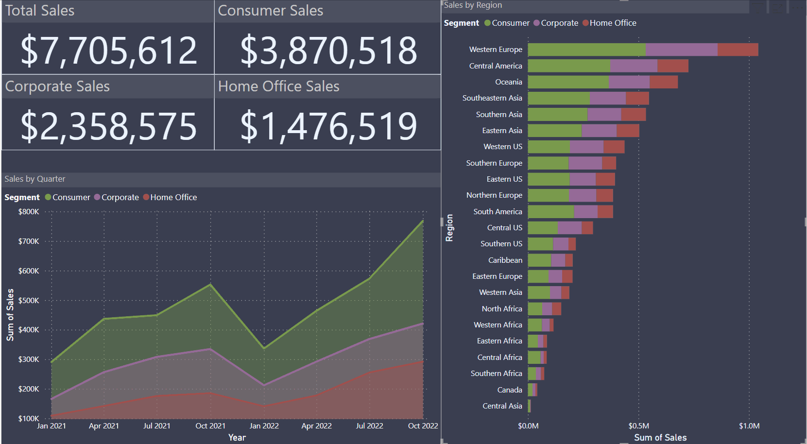
Visualization is of course very neat, but you can do that in Excel or a myriad of other programs. So, what is it that makes Power BI so useful? In a word, “interactivity.” A dashboard is created by adding a series of visuals, generated from your data, to a single page. Then, when you click on one asset of the visual, you will see how the remaining elements of the dashboard dynamically react, showing only the data related to what you selected. In the example below, we look at sales data from a fictional company. As you can see, the data is broken down by segment (consumer, corporate or home office), time period and region. Selecting one item will change the context of the entire dashboard. While this is a basic report, it can easily be expanded by pulling in additional data points to give the audience as much detail as required.
The uses of this powerful tool are almost endless. Whether you are a business analyst, an executive or a data scientist, this often-overlooked application will prove an invaluable addition to your repertoire.