Building a Data Culture Continued
Last week, we covered the basic planning involved in jump-starting a data culture in your organization: identify a high-leverage opportunity where Business Intelligence solutions can generate a “quick win” to demonstrate all the benefits BI has to offer.
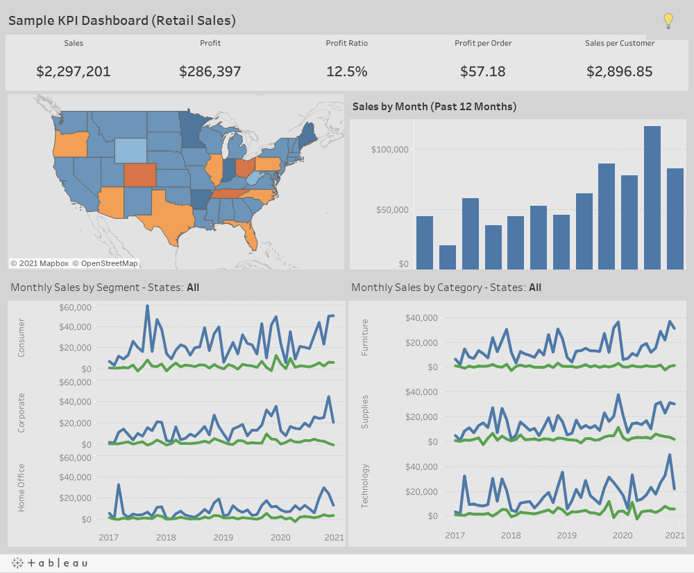
You’ve got management, IT, and a department of your choosing all agreeing to let you show them your stuff; you’ve identified some key metrics that are essential to the department head; and you’ve chosen a BI solution that you feel is most suitable. Now it’s time to put it all together in your demo dashboard.
Rule #1: Keep it simple
Avoid overloading the user with too much information at all costs. Remember, they’re new to this. Overwhelming them with a busy dashboard crammed with all information under the sun is a surefire way to turn them off to the whole concept. Select a handful of related metrics that you will be highlighting. Ideally, these metrics will all be derived from the same data source.
Rule #2a: Data first
Don’t worry too much about how pretty the dashboard may be; there will always be time to tweak the aesthetics later. This is not to say an ugly dashboard is acceptable. Use the Pareto principle and put in 20% of the effort to get 80% of the benefits. The data needs to be front and center! Make sure the key metrics are displayed in large/bold fonts, ideally at the top of the screen.
Rule #2b: Make sure the data is accurate!
This cannot be understated. Once you’ve got some semblance of a dashboard, you’ll want to exhaustively test out the data to ensure it matches the source. Pay special, close attention to any filters that are applied. It’s best to do this testing before adding visuals, as using a simple crosstab exposes the underlying numbers and makes comparisons much easier.
Rule #3: Show off the interactivity and visuals
The whole point of the demo dashboard is to demonstrate the benefits of being data focused. Plastering a few numbers, regardless of how important they are, is hardly inspiring. Back the numbers up with trendlines; slice and dice them several different ways to stoke the viewer’s imagination. Get the user clicking around, so they can see how the data changes based on their selections.
Rule #4: Make the dashboard readily accessible
The dashboard must be available on demand, and the data must be as up to date as possible for your would-be data champion to adopt your vision. The viewer will quickly abandon the project if they need to ask you to refresh the data periodically or wait for the report to be emailed to them on a daily basis.
Rule #5: Solicit feedback
You need to put on your rabbit ears and take note of all feedback given from your test user. Implement any improvements and resolve any pain points in a timely manner. Find out how useful this new system is to them.
Rinse and repeat
Hopefully by now you have a department head who fully understands the benefits of leveraging data within your organization and will be happy to share their positive experiences with others in the organization. The path forward should be clear at this point: implement a demo dashboard for the next department, solicit their feedback, improve, and expand.